Design OF

Design OF

Design OF featuring great design, architecture, fashion, graphics and innovation from across the globe.


Dotline

Dotline has been facing a huge business challenge, which is as same as others in the welfare industry: a shortage of human resources. This identity system design is to inspire a company’s vision to their staff, candidates, and related people. The company’s vision is Social Heroes. Dotline sees all staff who come for help in someone's daily life as heroes. The logo is a graphical symbol of a hero flipping a cloak and moving forward designed from the letters, D+L. As Dotline provides 7 business categories, the logos come in 7 different colors with each business name typed with a brand typeface

Continue reading
 

Sabbioni Branding

Grafiche Sabbioni required a new brand position to celebrate the firm's 60th year anniversary. Salt&Pepper worked with the company to create modern visual languages to promote this important milestone, highlighting the brand’s capabilities in sustainability in the box and traditional print processes. Salt&Pepper created an energetic, robust, and positive branding system, creating a line of 100 percent sustainable, using water-based inks and minimal paper waste to promote the company's core values.

Continue reading


SUMMER PALACE TOUR

The design team used 2.5D style to draw the three major architectural clusters in the Summer Palace, covering more than 20 traditional Chinese buildings in total, using black, red, and green colors to create a colorful visual experience. We also introduced the concept of "Small Hand-carry", hoping that visitors can easily play around the Summer Palace, holding the history in the palm of their hands, taking the beauty of the scenery at their fingertips, and carrying good gifts in their hands.

Continue reading


Terra

The curvilinear logo design with the theme of aroma drifting from the environment expresses a natural and high quality coffee experience. The individual labels are designed with a collage of local photographs that connect the producer's face with the place of origin, environment and consumers, and convey the individuality and charm of the unique coffee produced in each region.

Continue reading


Better Bodies Hi

Better Bodies Hi is a workout studio. They needed to create an environment where users after office work could gradually prepare their body and mind towards exercise. Therefore, they designed a typeface that transforms in three stages. As users move from the reception to the workout area, the typeface of the sign gradually changes to a thicker and larger. The typeface gradually guides and encourages the user to work out. They used this typeface in logo, website, and products, to create a brand identity.

Continue reading


Suprala Font Family

Suprala is a contemporary delicate humanist serif typeface, with beautifully balanced forms, perfect for branding and communications projects. Suprala’s round, elegant, and classically elegant design, supports all major Latin-based languages in twelve styles. True italics advance the aesthetics, bringing energy and making it suitable for modern applications. Each weight includes more than 700 glyphs with stylistic letter and numeral sets and alternative glyphs and discretionary ligatures.

Continue reading


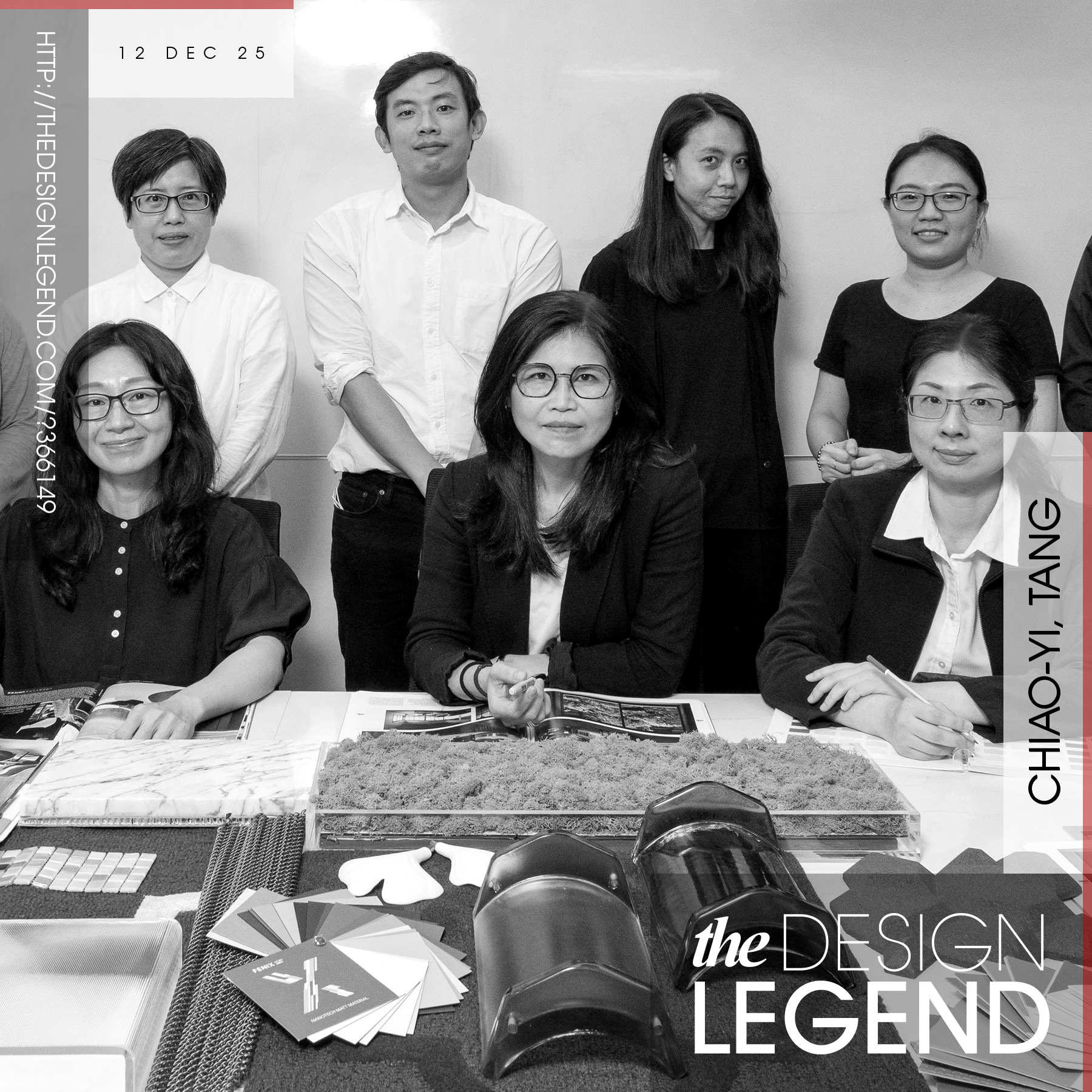
Legendary designers and their award-winning works.

Design Legends are extremely famous designers who make our World a better place with their good designs. Discover legendary designers and their innovative product designs, original art works, creative architecture, outstanding fashion designs and design strategies. Enjoy and explore original design works of award-winning designers, artists, architects, innovators and brands worldwide. Get inspired by creative designs.

Continue reading